Voyager: An Interactive Space Journey
App. It’s an app. I know. You were maybe hoping we were going to go on a real space journey in actual space. We are not going to do that at this time, but this is truly a close second: a AR mobile app for the National Air and Space Musuem that takes you through various quests. We’ll solve riddles, find objects and maybe even learn a thing or two. Let’s launch!
Project Scope: The purpose of the Voyager app is to create a mobile app, backed by user research, that enhances the users’ experience at the museum and encourages repeat visits. Additionally, the brief included a business objective: how does the museum potentially make money from the app?
Roles: Liza (Project Manager) — I just really like to plan sh*t. Time management and achieving objectives in a creative manner are my jam.
Hunter (Visual Designer) — Hunter was inn charge of taking our intangible ideas and making them tangible, workable and awesome. He’s a fast prototyper and has an eye for design detail.
Sayoh (UX Researcher)— Sayoh was in charge of the research aspect, from surveys to data to usability tests. She analyzed, synthesized and contextualized.
Users and Research: We started with research. First, we created a screener survey that looked at general museum visitor behavior. Once we had a base of responses from who had visited the Air and Space Museum in the past 3 years, we sent a targeted follow-up survey with questions about that specific experience. The surveys provided valuable insights from a wide range of visitors, but we wanted to go further so we trekked down to the National Mall one afternoon armed with interview questions and a camera. While two of walked around and interviewed visitors, our third group member observed and documented through contextual research.
After a week, we’d gathered enough data to synthesize with an affinity map and create personas and user journeys. Our target personas fell into three main groups:
- Parents with children
- Educators (in charge of children)
- Businesspeople just wandering around
The third group may be a little surprising, but several of our interviewees were in the city for business or a conference. Rather than sit in a hotel room, they opted to get out and take advantage of DC’s free museums. One caveat I’d like to mention is that the in-person interviews were done at the museum on a Tuesday late afternoon, so the crowd was different than one might see on a Saturday afternoon. The in-depth surveys, however, were a nice supplement and did corr0borate the interview data.
The main feedback we received indicated that users wanted help navigating the museum, finding out more information about exhibits and some kind of “scavenger hunt” for kids. Interestingly enough, a few savvy users mentioned AR as feature they’d like to see on an app for Air & Space.
In addition to the user research, we also created a competitive analysis of other similar attractions so we knew what we were up against.


Design Process: Now that we had sufficient data, we moved into design. We started with a feature prioritization. What would be the best use of our time and have the highest impact with users? We narrowed it down to navigation (an interactive map) and an AR scavenger hunt with quests and rewards. For two days, we brainstormed, just throwing ideas and sketches up onto whiteboards. Gradually, we shaped a first draft site map and user flows. From there, it was on to sketched wireframes. We each built out options, then regrouped, decided on the most feasible, shifted around navigation options, and moved into Sketch to create low-fi wireframes. Once we had low-fi wireframes of key screens, we moved them into InVision and built out the intended user flows.

Usability Testing: The low-fi wireframes in Invision allowed us to give test the flows. We assigned specific tasks to our users, like “How would you use this app to find the Wright Flyer?”, and then observed the process. A few things became clear very quickly: we didn’t have a reliable back button for users who accidentally skipped a screen in our AR quest onboarding, the language around the onboarding confused some users, the process felt out of alignment with what they expected (the order of how options were presented), a few buttons were too small, the purpose of the nav icons was unclear and the exhibit sort didn’t provide enough options.
With these changes in mind, we moved on to a high-fi prototype that addressed some (but not all) the issues. To get our MVP up and running, we selected the most pertinent problems and addressed those, while noting changes we’d like to make in our next roll-out. Take a look at a few screens from the final prototype below (Disclaimer: My right hand has broken bones with pins in it! I plan on re-editing images and formatting when my hand has less metal sticking out of it).


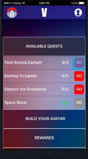
Users select quests and answer questions to find objects around the musuem. Because our user base was so broad, we determined the quests would have different levels. And, yes, adults were pretty excited about this idea, too. The feedback we got on the final product was positive across the board. Not only does the app help users navigate the museum, the quests tap into users’ competitiveness, keep kids engaged and learning, and provide in-depth information for those who just want to know more about the exhibits.
One of the most well-received features (on the business side) was the tangible rewards. The app has a section for badges that users can earn, but it isn’t just limited to the app. Kids can pick up actual sticker badges from in or near the gift shop and/or redeem points for small food items in the food court, encouraging additional purchases. Furthermore, specific and ongoing quests could also be sponsored. Airline companies regularly give grants to the Air and Space Museum. Investing in a specific or special quest is a unique way for the airline company to get marketing exporsure.
Final Thoughts: The project was a success for our group. Feedback from instructors and peers was positive. My personal preference would have been to do MORE usability tests so that the flows were perfect (double diamond, ya’ll), but we had a deadline. Nevertheless, we made the changes we could and planned out next steps for version 2.0.
Video is also coming soon, but check out the InVision prototype HERE.