REI Adventure Seekers Prototype
Alright, let’s get this case study started! Today, we’re taking a look at a prototype that I created in Axure, which is a beast of a program, and the design process to get there.
Problem, purpose and project scope:
The camping and hiking apparel industry is expected to grow over the next 5 years, but users are citing reasons like “lack of time” as well as “family commitments” as a reason why they aren’t getting out in nature as often as they’d like. Problem: lack of time. So how do we make camping, planning and shopping easier for customers, their families and their friends?

Solution:
Create a prototype companion site to REI with three main goals or user flows:
Find and book camping destinations
Create and share an interactive trip checklist with other campers or guests (make planning a breeze! A breeze, get it)?
Purchase REI gear for the trip through the site and via the checklist
2. Design prototype in Axure that includes:
An overall layout and global nav
Search bar
The interactive checklist
Product listing and product pages
A checkout process for 1 or more products
Consistent branding and upselling — showcase those related products and deals!
A way to contact the business to request products
Browse related products
Read and write reviews
Information about loyalty points or rewards
Design Process:
I approached the design process in a very linear fashion to make sure I covered all of the requirements of the brief. The point of the brief, I think, was that you weren’t supposed to be able to do it all in a prototype, but I sure as heck got close because I’m a nut about lists. AND I included several dinosaurs in my presentation, because nature and I because like dinosaurs.
Started with a card sort to see how users might arrange site information
Created an initial site map
Broke down project brief into 23 goals for the site and brainstormed ways to include them
Sketched out a first round of wireframes
Sketched an updated site map and user flows
Built wireframe pages in Axure and began to map out flows
Usability tests — requested that users run through my prototype and provide feedback
Refined site and user flows based on feedback
Presented my updated prototype and ran through the three user flows
Thunderous applause
Overall, my design process felt efficient, but I would have preferred more usability tests. The biggest obstacle in conducting more tests was my own unfamiliarity with Axure.
Users and Research:
Although the brief included initial research and personas, I did additional research about REI, the camping industry, competitors and target users. Typical buyers are those with disposable income, so upper middle class, and quality is a big factor in the decision to purchase. REI is beloved for its unique co-op model, where users get 10% on select purchases back on Dividend Day, and for its 100% satisfaction guarantee. None of the competitors (such as L.L. Bean, Patagonia, the North Face or Dick’s Sporting Goods) offered the same tangible rewards, nor did they allow for the same leniency on returns. REI gives buyers a full year to return products.
Additionally, REI is active in sustainability and conservation. The company goal, per its website, is to become climate neutral in operations by 2020 and it heavily invests in projects that benefit the environment. I wanted my prototype to continue to reflect these values.

Initial Sketches and Doodles:
After the card sort (which mostly gave me the direction I did NOT want to go) I drew an initial site map and user flow. A little rough, but efficient at this point.


And then a few of the first wireframes, which were even better before I spilled tea on them, if you can believe it:


Axure Prototyping
I like wireframing. I like sketching. I used to work in sales, but I much prefer jamming out to a playlist of the greatest hits of the early 2000s, while eating a bowl of cereal while I figure out how I’m going to solve all the problems in my project brief. That being said, Axure was a bit of a challenge. I watched a lot of videos where someone went through complex problems faster than my sales-turned-designer brain could process. However, I did get there and created a prototype for users to 1). Shop and checkout 2). Find a book a campground 3). Create a list of tasks and items that could be shared. As you’ll recall, those were my three goals and I added in the additional tidbits from the brief, as well.
I got very carried away and made these hi-fi prototypes, including a bunch of unnecessary nonsense content.


This is the interactive checklist, which is a bunch of layered dynamic panels that change when you click on the corresponding tab. I don’t think this is the most lovely design, but you get the idea. The items are linked to the product pages and, if you’ll notice on the project page above, you can add products to your list.
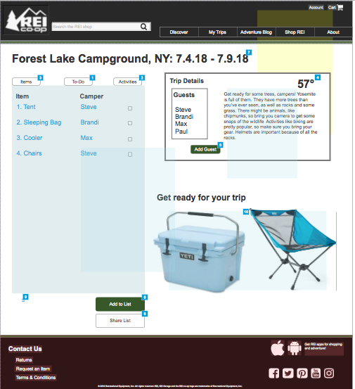
Users can also add guests to the trip details and share the list, as well as assigning items and to-dos to a user. We’ve also got some suggested products to upsell the heck out of people. Once you’ve bought Beigey Big Tent Tent, you’re going to need Cooler Than Ice Cold Cooler and Blue Springy Chair to round out your trip.
Summary and Next Steps:
This is probably about all you want to read, so I’m going to stop here. Overall, I ended up with 14 pages on my prototype and if you could view it, I swear you’d be able to click like a madman (madperson? yeah, madperson) and see some completed user flows. The biggest challenges, as I’ve mentioned, were learning Axure and getting enough usability tests. I also probably should have taken more pictures of my basic wireframes before I went crazy and added color and images.
But wait!
Right now, you’re thinking, “She said there would be dinosaurs!” Reader, there are. Our little bonus Adventure Seekers blog gives our users tips on things like interacting with the wildlife. Ignore that white font — it’s not great. Just focus on that bonus dino.

Video on this one coming soon! Priorities. I have to have most of a portfolio, you know?